Thursday, February 5, 2015

Review_Transparency

Synopsis of “Transparency”
Yingzi Zhang
In the very beginning, the article interpreted the definition of “transparency” in two levels by the dictionary and Gyorgy Kepes’s discovery in art works. The first level is easy to understand, which defines “transparency” as “an inherent quality of substance” that being pervious to light.  In the further level, “transparency” no longer means clear but ambiguous, which is “an inherent quality of organization”. As it is presented in the art work of Gyorgy Kepes, overlapped figure “implies a broader spatial order”. So, Colin Rowe classified transparency as “literal transparency” and “phenomenal transparency”.

According to Colin Rowe, cubist painting is an important source for the feeling for both literal and phenomenal transparency. Cezanne is an important painter for Cubism. Taking his Mont Sainte-Victore as an example, we can understand some features of Cubism, such as “frontality, suppression of depth, constracting of space, definition of light sources, tipping forward of objects, restricted palette, oblique and rectilinear grids and propensities toward peripheric development”.  Double nature of transparency is further illustrated in the comparison of relative similar cubist paintings, such as Picasso’s The Clarinet Prayer and Braque’s The Portuguese; Delaunay’s Simultaneous and Gris’s Still life; Moholy’s La Sarraz and Leger’s The Three Faces. From the beginning to the post cubism, we can figure out in painting, literal transparency is rather emphasize the sense of seeing through, the quality of material, deep and naturalistic space, while phenomenal transparency emphasize the independence of object and grid, multiple interoperations of organization,  shallow and abstracted space.

For architecture, compared to painting, the literal transparency is much easier to be understood since the existence of the third dimension.  But for phenomenal transparency is rather difficult to achieve. It’s not all about the transparency of materials, such as glass wall at the Bauhaus which kind shows spaces behind it as overlapping planes in painting. The key for phenomenal transparency is an interpretation of spaces based on both horizontal and vertical planes. The interaction of flexible horizontal and vertical planes can create ambiguous spaces. So, the unambiguous space in Bauhaus seems to be rather literal transparency but phenomenal transparency. To contrast, the example of Le Corbusier’s villa at Garches shows the transparency in elevation, structure and space. And Le Corbusier’s League of Nations project shows the phenomenal transparency in organization of building blocks and outdoor areas. According to Colin Rowe, these stratifications, devices by means of which space becomes constructed, substantial, and articulate, are the essence of phenomenal transparency. As far as I’m concerned, time and function, like multi-use, may be other factors that contribute to phenomenal transparency.

ARCH 639.600 FALL 2014. Review3_Rowe_Character and Composition

Review3_Rowe_Character and Composition
Yingzi

In the late eighteenth century, there was an explosion of architectural thoughts and ideas. “New experiences were stimulated by the chaos, new energies released by the confusion; both by arbitrary choice and pressure of circumstances, new conceptions of form were generated”. Driven by this ideological trend, Colin Rowe thought it to be in great sense to find the origins of some of the more significant attitudes on these new conceptions.  

Thus, two architectural vocabularies, character and composition, which attracted most major critical interest among the architectural profession are proposed by Rowe in this article and a discussion are made on the vicissitudes of them and some other related vocabularies in the nineteenth century.

According to Rowe, a successful building should be organized by good composition and simultaneously infused with appropriate character. And the presence of both of them at the same time is not guaranteed, since neither of them could automatically generate the other. Composition is an organization principal, or a movement in form, while character is “the impression of artistic individuality and the symbolic or functional expression of the purpose for which the building was constructed”. To better understand the compositional and characteristic beauty, two houses (Woolley Park and Endsleigh) are taken Rowe takes as the examples to indicate the character transformation in different buildings that even the same building type. Woolley Park shows typicality rather than character and is limited by certain irreducible formal restrictions. Endsleigh, however, is full of character in its naturalistic charm and in its features that conveying expression of purpose, such as roof, chimneys and porch. It is a kind of revolt against tradition and the “typical”.

Picturesque then was introduced and became popular during 1800 and 1830. However it was later found to be “emphasizing the pleasure of the eye, rather than the rational existence of the object”. And Gothic Revival was criticized for its “painful sense of unreality” as well as eclectic picturesque. So, something real was demanded by Cockerell as a new meaning of character.The sense of unreality make me think of gingerbread of structures, redundant elements, medley elevation styles. And the idea of "real", I think, lies on the necessity and logically explanation rather the taste and caprice. 

In late nineteenth and early twentieth century, the movement of modern architecture generated some themes in design like simplicity, true material, form of purpose, machine aesthetic. However, some of the designs are so neutral, objective and standardized that lose the character related to local culture. We can't tell the uniqueness of the architecture that it could be put in any place in the world, which is boring in some extend. These may be the factors later contribute to the rise of post modernism, which aims to preserve pre-modern elements. 

ARCH 639.600 FALL 2014. Review3_Program vs Paradigm

R3_Program vs Paradigm_Yingzi Zhang


Colin Rowe, in this essay Program vs Paradigm, trying to reveal the fundamental errors of modern architecture, questions several theories and thoughts at that time, such as Positivism, Transcendentalism, Classicism, neo-Rationalism, by investigating the relationship between program and paradigm, synonymously, between matter and mind, reality and speculation, fact and fantasy.

By the Oxford Dictionary, a program is defined as “a definite plan or scheme of any intended proceedings; an outline of abstract of something to be done”, while paradigms are, defined by Thomas Kuhn, “universally recognized scientific achievements that for a tome provide model problems and solutions to a community of practitioners”. An argument made by Rowe is that neither the position in worship of program or paradigm is adequate. Both of them are “relatively easy to destroy”. He has criticized the break of the relationship between program and paradigm (eg. data addiction in Positivism, excessive typological concerns in neo-Rationalism), and inspired by the dialectical interanimation method or hypothetical-deductive method (eg. knowledge of great criminal paradigms in detective novels).

To strengthen his argument, Rowe takes the “naive” city context of Austin as an example to show the “all-accommodating” urban planning idea of the Republic of Texas., which has nothing to do with location, culture, time and space. It’s like a plan without program. And then program based on facts is valued a lot by Positivism. However, according to Rowe, it is rarely neutral though it pretends to be. Then Rowe illustrates the drawings of Rainer Jagals to stress that “It is drawings such as these-desperate, translucent, eclectic, elegant, and ironical---and not the programmatic compilations of the data collectors that are going to affect our vision of the city”.

In my personal interpretation, Rowe has a positive attitude toward the neo-Rationalism and in terms of typology concerns. As to the big “dinner party”, we can see the future of neo-Rationalism. Modernism seemed to be dogmatic and rigid at that time, then, Rationalism appeared to show respect to tradition and combination of fact and history. But different from the simple architecture form of Rationalism and the fake architecture form of Classicism, neo-Rationalism tries to investigate the history and summarize a invariably foundation for architecture and urban design. Nowadays, when design, we do analysis of site, cultural, climate, traffic access, activity flow… Also, we check out codes, do program adjacencies… All these are a reflection of the interaction between program and paradigm.

PS: http://bombmagazine.org/article/2649/michael-bell
An interview with Micheal Bell by Magazine BOMB. He talked about something about city Houston and Typology. 

ARCH 639.600 FALL 2014. Review4 _Ideas, Talent, Poetics: A Problem of Manifesto_ Colin Rowe


Review4_Ideas, Talent, Poetics: A Problem of Manifesto_ Colin Rowe     
Yingzi

According to Rowe, one should be skeptical of those “revolutionary” manifestoes which not so much concerned with the fate of cultural and society but the self-dramatization of their authors.  Ideas in this kind of manifestoes, without mediation of “talent”, will finally result in “poetics”. Considering “there might remain something to be said on behalf of tradition”, Colin Rowe tries to promote a possible reciprocity between tradition and revolution, talent and ideas.

To contrast the attributes of talent and the attributes of ideation, an observation method, parlor game, is brought up. That is because the ultimate discrimination between talent and ideas is not easy, as it is suggested in Sir Isaiah Berlin’s The Hedgehog and the Fox.

In this “game”, we can see, Rowe has made a lot of observations on architecture and music, such as the dome of Basilica Superga and San Lorenzo, the Opera and Sainte-Genevieve, St. Martin-in-the-Fields and Christ Church and the compositions of music by Berlioz and Beethoven.  And at end of the game, Rowe declares that neither the presence of talent nor the presence of ideas is a necessary guarantee of quality. But if the “ideas” are little more than the fantasies of cultural primitives, then “talent” is a vivacious employment of knowledge and education. This makes me feel talent to be of great importance once ideas are of little sense.

dome of San Lorenzo

dome of Superga

After looking at several manifesto pieces Rowe discussed in this essay, I feel like some have very strong-willing and over-simple idea or concept in it, but lack applicability. “The manifesto piece avoids local contingencies and it only enters the city as the adversary of context”. Douglas House is like “a ship without any relationship with docks”. The house in Friedrichstadt has strong axis with the street and seems to be an opportunism. 


Douglas House

Douglas House

elevations and plans of  Douglas House

Fallingwater
Google's NYC operations


At the Cite de Refuge, the stimulating conflict between abstract message of a manifesto culture and specific location is also revealed. These all make me think of the rationalism in composing and the location concerned character in design. The falling water is a good case in my opinion. You can see kind of floating flexibility there and a good continuity with the topography. Moreover, in historic districts, it is not the topography but the historic atmosphere that challenges the revolution. But there are always the strategies for ideas and talent. Look at the home for Google's NYC operations in Chelsea Historic District. The new black box is sitting upon the old building, creating a contrast in material but continuity in form. As far as I am concerned, it's good to bring the abstract message down to earth, which means stick on one big idea and then enrich it with rational talents under the confines of specifics. 


ARCH 639.600 FALL 2014. Review5: The Present Urban Predicament_ Colin Rowe

Review5: The Present Urban Predicament_ Colin Rowe
Yingzi Zhang

In the first part of the essay, Rowe points out the several commentaries concerns on house and city at that time and discovers a paradox of complex house-simple city. Further, he attacks the modern architecture on no concerns about space and ascribes the inevitable death of it. And then, he tries to come up the criteria or features of good architecture that corresponding to urbanism by comparing several examples in the frame of “ingenuity vs contingency” ”object vs context” “cause vs cure”.

From Rowe’s perspective, the modern architecture is addicted to “physics envy” ”Zeitgeist worship” ”object  fixation” ”stradaphobia”, tending to “produce objects rather than spaces, has been highly involve with problems of the built solid and very little with problems of the unbuilt void”. These are all the factors contribute to her demise.

To help “the patient” (modern architecture, contemporary urbanism), Rowe puts forward some specific examples to find the tactic.

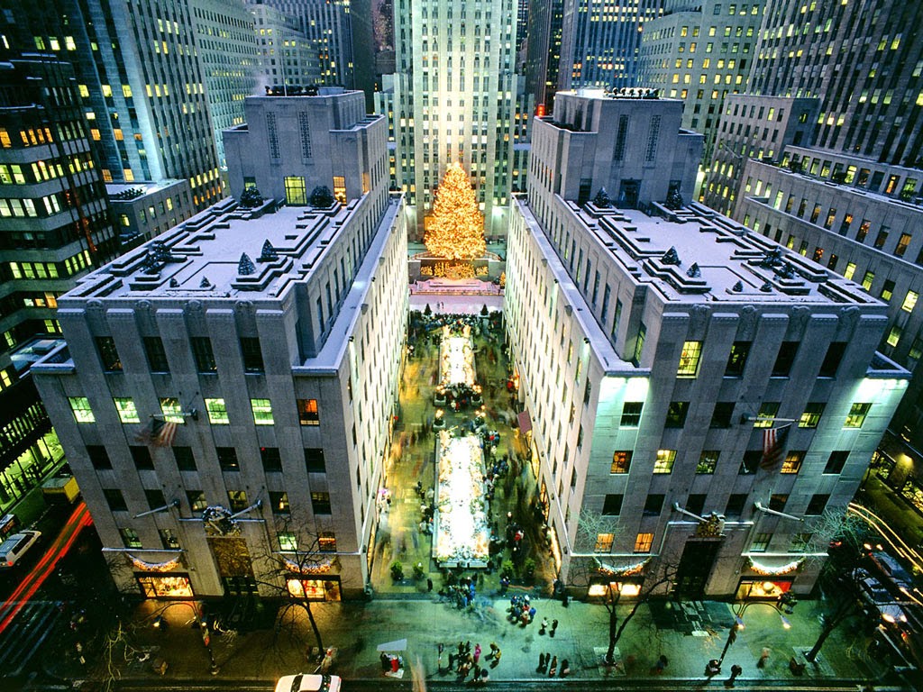
In Rome and London, there is a prevailing idea of relative uniform ceiling and texture and contrary idea of object. Then, there appears a concept of horizontal datum, “below which assertions are few and invariably circumspect and above which, plastic excitement”. This condition is extremely magnified in Manhattan, New York. They have the celebration of object on the top, meanwhile, maintains to be quiet at street level.  For instance, the Rockefeller Center is highly praised by Rowe. It showed an ideal empirical concession in its extremely astonishing height and an ideal normative procedure at the street level with two low-height classic building, which also have a conversation with the church  next street.


Rockefeller Center

Another tactic is perfectly showed in the case Uffizi. Unlike the space occupier, St. Die and prime solid, Unite, Uffizi is a collective structure with central void figure. The structure has a closely response to old context outside and a free order to private space inside. It “confers a value upon both new and old”. This may a good model to get the balance between uniformity and randomness. And I think, it actually has a reveal in English by-law housing in nineteenth century.

Rowe also addressed back on the topic of garden. The attention on building’s relationship to city context is raised again. He admires Mondrian and Van Doesburg’s works. Looking at the picture Victory Boogie Woogie and inspired from it, Rowe has an idea of recognizing the merits of modern architecture and traditional city separately and facilitate their profitable intercourse.


Reflection

After Finish reading the essay, I have a strong feeling of the Gestalt psychology theory introduced in early 20th century, right before the time of this essay. It's the perception of a composition as a whole. While each of the individual parts has meaning on their own, taken together, the meaning may change. Your ideas bounce back and forth. It is all about the understanding of all the bits and pieces working in unison.

This theory, further interpret as in architecture field, is related to the perspective on the intercourse of buildings, gardens, piazzas… as individual parts in the background of city context as a whole. Look at the figure-ground relationship in the painting La Danse by Heri Matisse, it is easy to pick out the figure from the ground which is in the tone of even color. This might be understood as the “object fixation” in modern architecture. Rowe doesn’t like this. What he like is the painting Victory Boogie Woogie which has a multi-perspective on figures that are hard to pick out from ground. It’s also variant of transparency.


La Danse by Heri Matisse


Victory Boogie Woogie by Van Doesburg


As to one of the tactics showed in Uffizi, I think of theories from Quatreme de Quincy. He values the streets, the Zeilenbau. The reconstruction of Paris also has the same idea. This theory later developed by Beaux-Arts into a “fill-in” design strategy. It seems to be the same idea of Uffizi. Treat differently outside and inside. One of the case adopted this design strategy is east wing of the National Gallery of Arts, designed by Pei. It well fits in the site. But the gesture may be a little bit excessive.
Plan of National Gallery of Arts

Monday, April 21, 2014

ARCH689 Project 2 Sierpinski Facade

Project 2 Parametric Modeling Design

Mission In this project, I’d like to focus on the parametric facade, which is related to my studio project. I wanna create a triangular pattern by using weavebird’s sierpinski node, as well as some controllable open triangle shading devices, inspired by an example shared on the grasshopper website. 


Here is the rendering image of the facade.


Project Background


The site locates in the Museum District in the center of Houston. My project values the conversation between MFA, churchs and mine. Thus, after site analysis, triangular form is designed to be the main element 


For the main exhibition hall, to the northwest , pieces of triangular metal panels are imagined to be the shading facade.


Parametric Facade
Let's see how the facade works in GH.


Step 1
Import SK model into Rhino and use wbedges to extract the mesh edge to tell the boundary of the facade


Step 2
Define and draw the boundary of the facade. As the trapezoid can't be made up by repeated triangles, boundary is drew as parallelogram for shaping similar triangle patterns later.


Step 3
Create sierpinski pattern for the facade. Use wbsierpinski node as well as wbtriangles to subdivide the surface into several sierpinski triangles.


Step 4
Pipe the structure


Step 5
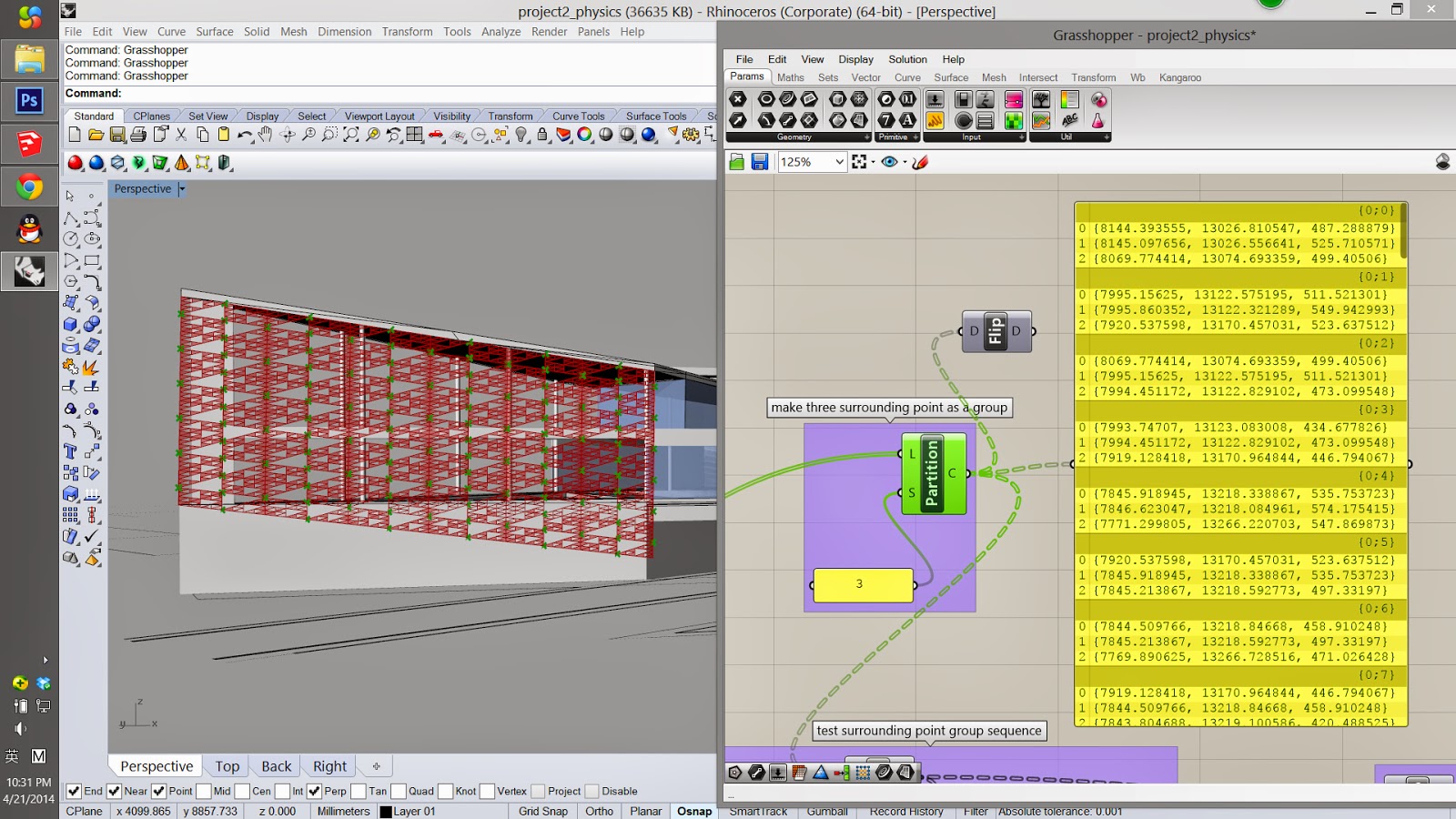
Create the shading device. Certain large triangular opening is designed to attach a controllable shading device. Get the corner points of each triangle.


Step 6
Group every three corner points 


Step 7
Get the central point of each triangle that need to attach the shading device
Pick out one typical triangle and create a vector perpendicular to it as the translation for the central points


 Step 8
Extrude three triangle sides into the moved central point to separately form three fins of the device


Step 9
Rotate the fins by control the rotating angle


Step 10
Extrude pattern mesh and cap to form a closed brep as the metal panel


 Step 11
Create another brep to cut the exceeded panel


 Step 12
Bake the GH model at the end. Here we are!


Monday, March 24, 2014

ARCH689 Project 1 Main Station Stuttgart Entrance


Project Description --- “Main Station Stuttgart”

Yingzi Zhang

The project is based on the Main Station Stuttgart. It is a continuous shell roof covers the whole underground space, everywhere admitting natural light and ventilation via the chalice eyes. There are two kind of “eyes”. One is the entrance of the station and the other one is the light-scoop eye, lighting the station hall below. And the modeling of them is pretty similar, so, I will mainly focus on the modeling progress of the main entrance.

As starting modeling, I divided the entrance into two parts: the dome and the main vertical circulation.

For the dome part, the basic idea is to anchor the edge of a elliptic mesh and utilize the Uforce and Kangaroo component to make it deform under the  gravity force to give a form in pure tension. Then trim the semi-sphere dome by an ellipsoid to create the entrance.

For the vertical circulation part, create a curve whose end points separately located on two parallel elliptic curves, and then sweep it along them. The curve is defined by the math equation, y3=ax. Since it's a tunnel for circulation, another similar surface is created adjacent to it and the tunnel is cut out by the intersection.
original size picture sharing link


mesh for dome

dome

GH for dome

dome rendering

vertical circulation modeling S1

vertical circulation modeling S2

GH for sweeping curve 

rendering for S2

vertical circulation modeling S3

final entrance rendering 

top view

bottom view

front view

right view

GH for light-scoop eyes' dome  (right one in the upper pic)

perspective 1

perspective 2

perspective 3